Apps Need Room To Breathe!
Android is a complex operating system. There’s a lot more variable when developer for Android. Things are unpredictable when it comes to knowing what phone your user will be on. There’s literally no limit to how many different kinds of phones could be running Android on a given day. If you don’t know what you’re doing this can be dangerous for your layouts.
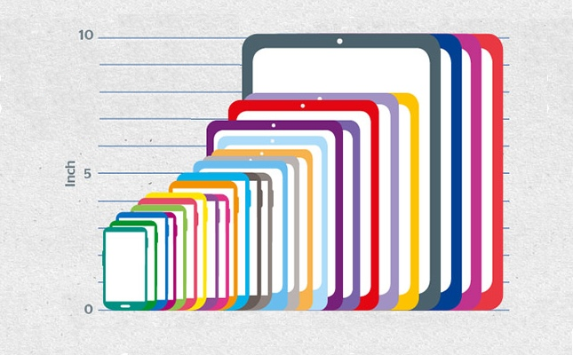
How so? Doesn’t everything work the same from phone to phone? Well, no actually. Things function very similarly, but different phones have different characteristics that can drastically change a user’s experience. Take screen size for example. You could design an app and have one user download it on a phone with a 4’’ screen and another on a 6’’ screen. This may not sound like a huge difference (2 inches is rarely a big decider life), but when it comes to a screen size that’s literally 50% more screen space on one device than another!
How things can go very, very wrong:
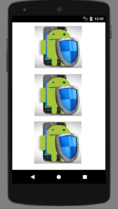
If you don’t take different screen sizes into account, then users will most likely miss out on important info. When you’re first learning about how to develop Android apps you’ll most likely use LinearLayout a lot to organize your apps. This layout takes one view (text, image, button, etc.) and then lines up the next one in a list side by side. Or you can change it to go vertically. Either way the end result is a neat row/column of views. Here’s an image to help you visualize:
But what happens if when your developing you only test the layout on your phone (let’s assume its huge). Things may look great to you, but when you publish the app and someone with a smaller phone uses it this is what they might see:
How we can prep for things to go very, very wrong:
Trust me as I made this mistake on the first app I ever published: It’s not a fun mistake to make. Your app is a work of art. It’s something that you created from nothing and want to show off to your friends, family, and the world. So when you have someone download it and instantly their greeted with a funky looking layout…well it’s not the best feeling. Luckily, we can learn from our mistakes and prep for them in the future!
There are situations where you want to use LinearLayout and there are situations where its best to avoid it. Sometimes you may want to keep the row/column but add scrolling capability to it instead. Android developers have experienced all these scenarios, and that’s why there’s more options than just LinearLayout.
Layouts like ConstraintLayout and RelativeLayout allow you to position views in relation to one another as well as to their parent. So you could position pictures on your screen to “attach” to the right or left side, and make your layout look a lot more professional. That’s of course just the tip of the iceberg though. There are different screen densities to account for when choosing what images to use. And you can also have portions of your screen appear/disappear by using fragments. Don’t worry we’ll have posts on both of these topics coming up soon!
If you’re interested in learning more about styling your apps for different screen sizes and how to make your layouts ready for professional use, checkout Phonlab’s Android App Developer course!


Super Fans always leave a comment :-)