
Android’s Developer Website Just Got A BIG Makeover
If you’ve ever thought about developing for Android then chances are you’ve at least stumbled upon developer.android.com. And chances are you left with a bitter taste in your mouth. Fear not, things are looking up.
I remember my first time looking at Android’s developer docs. I was a novice developer and as such the website was chock-full of useful information, but it seemed borderline impossible to navigate. Countless topics linked into one another describing the different components of an app. Couple this with all the attributes listed for each subject, and your brain quickly starts to spin.
What’s New?
I’ve discussed this navigation difficulty with others before, and that’s why I was so happy to hear the website just got a makeover. First off, it looks much better. Whitespace is used to give the new layout a sleeker more aesthetic look while the landing page emphasizes a preview for Android P. Scrolling down from there the home page is neatly divided. Sections for featured topics, material design, and where to begin your development journey pave the path.
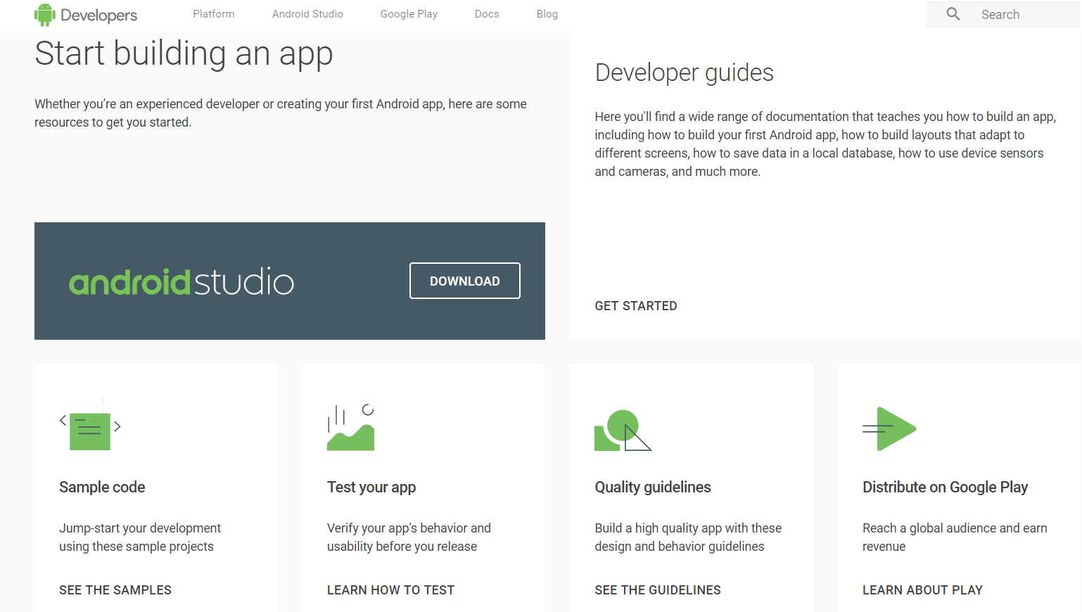
But, of course, there’s much much more to this website than how it looks. The most important thing is that someone who finds themselves here actually learns about what they’re looking for. The new website does a much better job of guiding users who are in uncharted territory. Selecting “Docs” in the top banner takes users to this page.

In here the core developer topics that every android programmer NEEDS to know about are listed. Clicking on each of these links will take the user to a simple explanation accompanied with an intro video. Then immediately below these are trees of related/more in-depth topics. The result is an easy cursory explanation of each topic and then more complicated explanations for those that want to learn more.
Material Design and More
The website has tons of sections and features, but one other one I’d like to highlight is the “Design & Quality” tab. It’s important to remember that there’s more to developing that just creating sound logic. Users of your apps also have come to expect high quality layouts and design patterns. This section of the website helps explain to developers how to wow users with apps that know what they want before even they do.

In summary, the old developer website was certainly useful, you just needed to know what you were looking for. The new model offers a much easier guide for new entrants. It takes them by the hand and shows them both what topics are easy to comprehend and what fundamentals should be learned first. Overall I think the new website is a vast improvement to its somewhat clunky counterpart, and I look forward to using it as my development journey continues.
Have you check out the new site and feel that it’s still missing anything? Let us know in the comments below!
Super Fans always leave a comment :-)