Backing Away From The Back Button
If you ever have a conversation between an Android user and an iPhone user, each will have their arguments for why one phone is superior. While many of the differences are in the software, one is glaringly different between the two: the back button. At least is used to be, but we may be seeing the end of days for this feature.
Q Follows P:
The back button is one of the most prominent features on Android phones. At least it was, but there has been discussion recently about moving deeper into the world of gesture recognition. The idea is to move closer to a buttonless screen, and thus create more screen real estate for users on smaller devices. Android Pie took a step in this direction with some of its changes in navigation between apps, and Q will likely continue the trend.
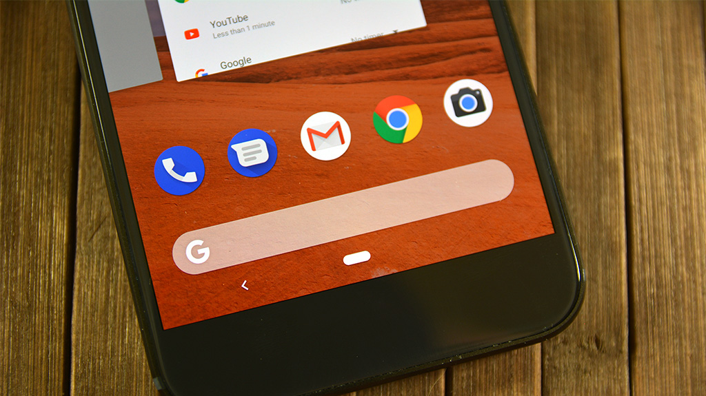
 If you own a phone that operates on Pie, then it likely took you a few days to adjust. The whole process of navigating between apps is different from Oreo. Instead of swiping left or right to kill apps you swipe them up (much like iOS). And while Pie still has a back button on the left side of Pixel devices, there are some unique interactions you can use with the bottom nav bar.
What’s New With Q?
On Pie phones today if you swipe from the left side of the nav bar over to the right, your phone will exit the current app and open whatever app you were using just before it. What’s more, if you swipe to the right and don’t release, you’ll be able to scroll between all of your apps to select one quickly. It’s not too different from checking all the paused apps and selecting one, but one swipe actions put a grin on your face.
Q is looking to do just this by removing the back button entirely and replacing it with a swipe to the left. The exact motion discussed above, just in reverse. So when users want to back out of an application or go back in an app, they will swipe instead of pressing the back button. Whether you like it or not, this is a pretty drastic change from years of tradition on a feature that has separated Android from iOS.
Swiping: The Good, Bad, and Ugly:
My initial reaction to this was not a good one. It seemed rather counter intuitive to have users swipe in one direction to go back in an app, and swipe in the opposite direction to go “back” to other apps. Change is scary. But if you can get past that, then this could make for an interesting user experience. If we take it one step further and swipe up in place of the home button, then the entire bottom drawer could cease to exist. A marginal change, but every centimeter counts when we only have a few to deal with.
These changes have not been confirmed, and I’m still undecided on how I feel. But I think it’s important to not jump on the bandwagon of “Change is bad”. Q could bring some really cool things to the Android world, and for all we know in a few years we’ll be looking back at the old ways of navigation and shaking our heads!
What are your thoughts on Q’s possible removal of the back button? How about the other changes we’ve talked about with Q? Let us know in the comments below!


Super Fans always leave a comment :-)